
Yazi Candle
Introducing Yazi, a minimalist candle brand whose name playfully means 'Duck' in Mandarin. In a marketplace crowded with overly complicated names and ornate designs, Yazi stands apart through its commitment to bold simplicity. The vision was to create a brand that is immediately catchy, effortlessly stylish, and memorable—proving that a simple, slick design can make a far more impactful statement.
Research and Inspiration
The foundational stage of this project involved conducting a competitive analysis of the current candle market. I meticulously studied a wide range of existing product labels to deconstruct their design strategies and identify potential areas for innovation.
This research revealed a dominant trend of visual clutter, characterized by overcrowded layouts, excessive typography, and a lack of clear informational hierarchy. This insight became the direct catalyst for Yazi's design philosophy. I was inspired to consciously reject this complexity, instead championing a minimalist approach that prioritizes ease of reading, clean aesthetics, and a sense of tranquil sophistication.
Sketching and Conceptualization

With a clear minimalist direction established from research, the initial ideas for Yazi began to take form through rapid sketching. The brand's name, a meaningful inspiration from my girlfriend meaning "duck" in Mandarin, guided the conceptual exploration. This stage focused on translating this personal connection into a mark of subtle sophistication, moving away from literal interpretations. Dozens of concepts were drafted, exploring how to integrate abstract avian motifs, elegant typographic treatments, and minimalist silhouettes that evoked a sense of playfulness and warmth. The goal was to balance this personal narrative with a clean, modern aesthetic, ultimately refining the sketches into a core concept that felt both unique and timeless.
Digital Execution
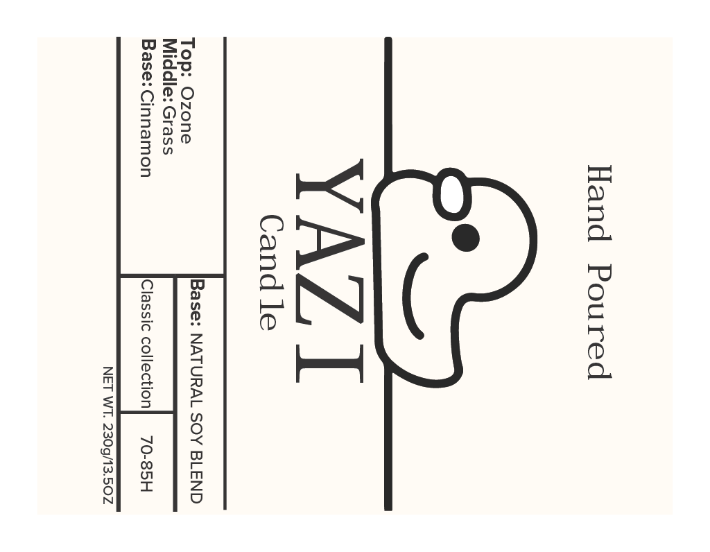
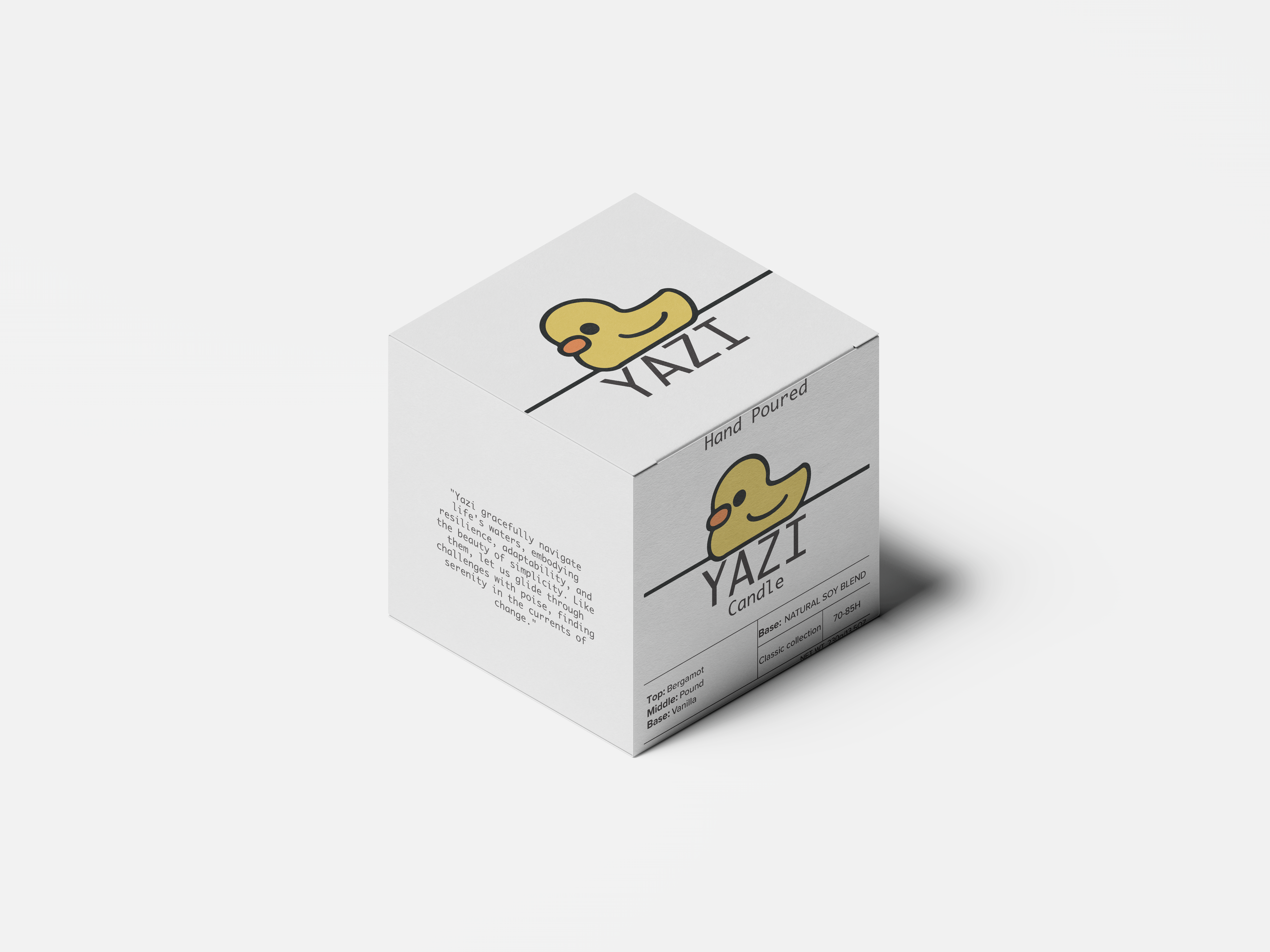
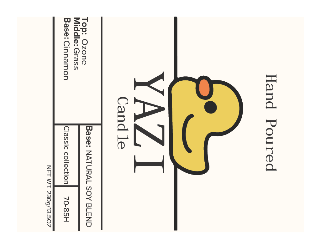
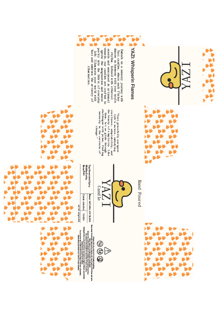
The final designs were brought to life digitally, where the branding system was fully realized across multiple products. A key differentiator was established through color to signify the candle's scent intensity. Candles with stronger, more complex flavors feature the Yazi logo in a vibrant, accent color, creating an immediate visual cue for a potent aromatic experience. In contrast, the simpler, more subtle scents are elegantly packaged with a classic black and white version of the logo, communicating purity and understated sophistication.
This cohesive system was then applied to a full suite of packaging, including carefully crafted boxes and reusable cotton bags. Each element, from the primary logo to the typography on the packaging, was meticulously designed to ensure consistency. This digital phase ensured that the Yazi brand is not only visually striking on a single candle but also scalable and instantly recognizable across an entire product line, from the smallest detail to the overall unboxing experience.
Review and Refinement
The iterative design process for Yazi was greatly enriched by the invaluable feedback received from classmates throughout the project. This collaborative critique served as a crucial reality check, highlighting both the strengths and areas for improvement in the initial concepts. Their perspectives helped me identify elements that were unclear or not resonating as intended, pushing the design beyond my own subjective preferences.
Guided by this feedback, the brand underwent significant refinement. The journey from the first design iteration to the final version involved meticulously adjusting typography for better legibility, simplifying the logo for greater impact at a small scale, and rethinking the color palette to ensure the contrast between the classic and bold scent lines was both intuitive and visually appealing. Each round of revisions was a step toward a more polished, effective, and user-centered brand identity for Yazi.